Let’s be honest, when you land on someone’s Instagram profile, the first thing that grabs your attention isn’t their captions or hashtags; it’s the visuals. Instagram is all about first impressions, and your profile and instagram aesthetic sets the tone for how people perceive your brand or personality. Everything from your feed layout to your bio and even your Instagram Highlight Covers contributes to that first impression.
Highlight covers, though small in size, play a big role in shaping how cohesive and attractive your profile looks. They create order, give structure, and help visitors quickly understand who you are and what your content is about. In today’s competitive social media world, an aesthetically pleasing profile isn’t just a bonus, it’s a necessity.
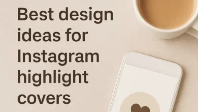
What Are Instagram Highlight Covers?
Instagram Highlight Covers are the circular icons that appear right under your bio, representing your saved Stories. Think of them as the “chapters” of your Instagram presence — neatly categorized for anyone visiting your profile.
While “Highlights” store your past Stories, the Highlight Covers are the static images that visually represent those categories. For instance, a travel blogger might have highlight covers like “Italy,” “Beach Trips,” and “Cafés”, each with a matching icon or color.
When someone visits your profile, these covers are among the first elements they see. A well-designed highlight cover not only helps organize your content but also adds to your overall Instagram aesthetics and brand personality.
Why Aesthetics Matter on Instagram
Instagram is a visual-first platform. Studies show that users form an impression of a profile within less than seven seconds, and accounts with a cohesive visual identity can boost engagement rates by up to 40%. That means your aesthetic choices — colors, fonts, icons, and design consistency — directly influence whether someone follows you or scrolls away.
A well-curated profile tells a visual story. It builds trust, evokes emotion, and communicates professionalism without a single word. Whether you’re a brand, influencer, or creator, your Instagram aesthetics define your online identity.
From filters to grid layouts and, yes, Highlight Covers, every visual choice reflects your style and purpose. When these elements are aligned, they create a sense of harmony, making your page feel intentional and visually satisfying.
How Highlight Covers Enhance Profile Aesthetics
Highlight Covers act like the finishing touch on your profile’s visual design. They bridge the gap between your feed and your Stories, ensuring a seamless and cohesive look.
Here’s how they make an impact:
| Design Element | How It Enhances Aesthetics |
| Color Consistency | Creates visual harmony and aligns with your Instagram feed colors. |
| Brand Reflection | Reinforces your identity through recognizable tones, fonts, and icons. |
| Professional Appeal | Makes your profile look polished and trustworthy. |
| Mood Setting | Communicates your brand’s vibe — calm, playful, or luxurious. |
Think of top-tier brands like Glossier or Alo Yoga, their highlight covers use muted tones and clean icons that mirror their brand identity. The result? A perfectly aligned, visually delightful experience that keeps users scrolling.
Branding and Identity Through Highlight Covers

Your Instagram Highlight Covers are more than decorative circles, they are mini brand billboards. Each one has the potential to reinforce your identity and improve brand recognition.
Consistency is the secret here. When users repeatedly see your signature colors or icon style, they start associating those visuals with your brand. This builds subconscious familiarity and trust, which is crucial for maintaining long-term followers.
For instance, fashion brands often use sleek black-and-white icons to express sophistication, while wellness brands lean toward earthy tones and organic shapes to evoke calmness. Influencers and creators also benefit from cohesive covers because they turn random Stories into an intentional visual narrative, one that reflects personality and professionalism.
In short, your highlight covers communicate who you are before your content even loads.
Emotional and Psychological Impact of Design
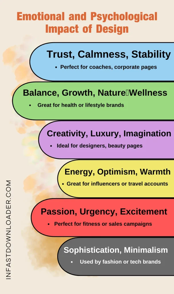
Design isn’t just about what looks nice, it’s about what feels right. The colors, shapes, and icons used in your Instagram Highlight Covers can trigger specific emotions and perceptions.
- Warm tones like pinks and oranges often feel friendly and inviting.
- Cool tones such as blue and green convey calmness, trust, and balance.
- Monochrome or neutral palettes suggest luxury and sophistication.
Psychologically, our brains crave visual order. Clean, consistent covers help users process information faster and feel more comfortable engaging with your profile. When your aesthetic matches your brand’s emotion — whether that’s fun, modern, or high-end, you’re not just designing; you’re storytelling through visuals.
Common Mistakes to Avoid When Choosing Highlight Covers
Even the most creative profiles can lose their charm with poor design choices. Here are common pitfalls to avoid:
- Overly bright or clashing colors: These can distract from your overall theme.
- Inconsistent design styles: Mixing flat icons with detailed illustrations breaks visual harmony.
- Unreadable fonts or tiny icons: Remember, highlight covers are small — clarity is key.
- Constantly changing designs: Frequent changes can confuse followers and weaken brand identity.
- Ignoring alignment with your feed: Highlight covers should complement your grid, not compete with it.
Keep things simple, balanced, and true to your brand’s style.
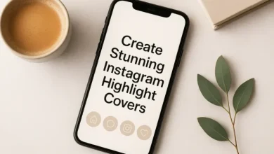
Tips for Creating Aesthetic Highlight Covers

Want to create highlight covers that instantly elevate your profile? Follow these proven tips:
- Stick to your brand palette: Choose 2–3 main colors that align with your logo and feed.
- Use minimalist icons: Simple visuals are more memorable and easier to recognize.
- Leave breathing space: Don’t overcrowd your design; white space keeps things elegant.
- Match your overall theme: If your feed is vintage-inspired, avoid neon icons, stay stylistically consistent.
- Use reliable tools: Platforms like Canva, Infast or photoshop offer ready-to-edit highlight cover templates.
- Test visibility: Always preview how your covers look on both dark and light mode.
Remember: the goal isn’t just to make something pretty, but to communicate your brand’s story visually. A well-designed highlight cover feels effortless yet intentional, giving your profile a professional and inviting touch.
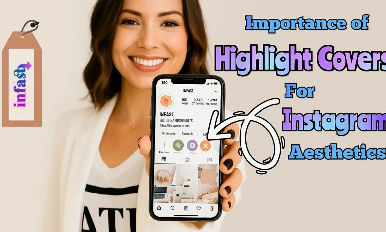
Conclusion: Importance of Highlight Covers
Instagram Highlight Covers might seem like minor details, but in reality, they hold incredible power in shaping your profile’s overall aesthetic and brand identity. A cohesive design doesn’t just please the eye, it builds trust, enhances professionalism, and encourages users to stay longer and engage more.
If you want to make your profile stand out, start by refining your highlights. In Infast’s Instagram Highlight Covers Downloader, we’ll dive into how to create, customize, and download perfectly matching covers, so you can turn your vision into scroll-stopping visuals.